Client RaterBee (renamed Becco Jan 2020)
Role UX Designer, Client Facilitator
Timeframe 4 weeks
Tools Trello, Sketch, InVision
Key Deliverables Wireframes, clickable prototype, site map, research synthesis
Team Nicole Lee, Amanda Palomino, Sebastian Brennes, Matthew Peters
Final walkthrough
The Challenge
Our challenge was to create a product that would use the data collected from RaterBee’s customer feedback system to show how employees, stores, and companies are performing.

I started by examining the already existing principles above and other parts of RaterBee’s setup to determine which direction to proceed in. The data we would be working with is pulled from a series of short questions answered by customers during the time of transaction on a tablet at the register (Image A). Once answers and data are collected on the back-end, the reports are presented on a spreadsheet (Image B) that gives a weekly summary and the transaction details.
The goal is to take the information populated to the spreadsheet reports and present them in a way that can be used to measure performance. RaterBee was looking for a way to pinpoint areas that excel or need improvement.

Image A

Image B
The Research
Next, the team conducted various methods of research both independently and collaboratively to collect data that would shape the next steps of our process.
Understanding the Market
Competitors that were accomplishing similar feats to what RaterBee was working towards included Peakon, Honestly, and Medallia to name a few. The research we did into these direct and indirect competitors showed repeating features that lends a hand in our design with best practices within the market. The trends were as follows:
Overview with important information
Bar/pie charts
Best/worst employees
Domain Research
Writing down takeaways and synthesis for User and SME interviews
Speaking with Users
Modular layout
Metrics measuring employee performance
Comparative line graph
As the team continued research, I conducted research on statistics on the advantages of having a dashboard setup and the different modules that work for employers and employees. Competitors all provide more than just results by giving action plans on what to do with the data. Giving a customizable setup to clients would benefit the performance of the stores and employees because they can choose which datapoints they want to focus on more.
“Companies that excel at customers experience grow revenues 4-8% above their competition. Superior experiences deliver 6-14x higher customer lifecycle value”
— Lexalytics.com

We collected insights from interviewing seven subject matter experts and users ranging in occupations from former operations managers to retail store managers and associates.
Seeing trends: Users needs feedback displayed in a way that shows patterns clearly in order to encourage continued or improved behaviors and performance
Specific feedback is best: Users want the feedback collected from customers to be specific in order to identify areas that need attention or deserve praise. The more specific, the more beneficial the feedback is for the employee, manager, and company.
“Stranger —to friend— to ambassador of brand and customer speaks highly of you and experience of brand”
— Ed Stagman
Retailers all have various values: Users emphasized that every company has its own values it follows. It’s important to be able to customize the product to accommodate all companies and their needs when using the product
“What matters most in store depends on what each specific retailer values”
— Ann Stagman, LuluLemon Store Keyholder
Benchmarking is key: There needs to be a way to indicate company accomplishments relative to a criterion. This will help with visualizing how employees and stores are doing. Without a standard to follow, it’s difficult to see what changes should be made
I used the information collected from interviews in an affinity mapping session to identify needs and wants that should be met by our final design.

The Problem
Store managers as well as upper management need a dynamic interface that can display customer feedback analytics in order to clearly identify areas of improvement and examine the relationship between customer experience and sales.
To supplement the problem statement, we came up with three design principles to support further ideation and creation of the product:
Cater to your audience
Focus on the audience, the purpose, and the storyline for each visualization as well as catering the data to them. We want to only present relevant data to each company.
The Ideation
The user persona below was used to keep our goals and designs in line with potential users.

Provide clarity
Present the data with the utmost accuracy, transparency, and clarity. The interface should be straightforward so that each visualization properly represents the data.
Respect for time
Not wasting their time is a gesture of courtesy and respect. Information should be quickly interpretable. The information must be clearly laid out and easily glanceable.

From the research gathered, we created paper concepts through a time-boxed sketching session to encourage divergent thinking.
As a team we selected concept that showed best practices with the research done. We created and tested digital prototypes with users sourced by the client and by ourselves. Collectively we had 5 concepts total to begin scoping down a finalized converged concept.
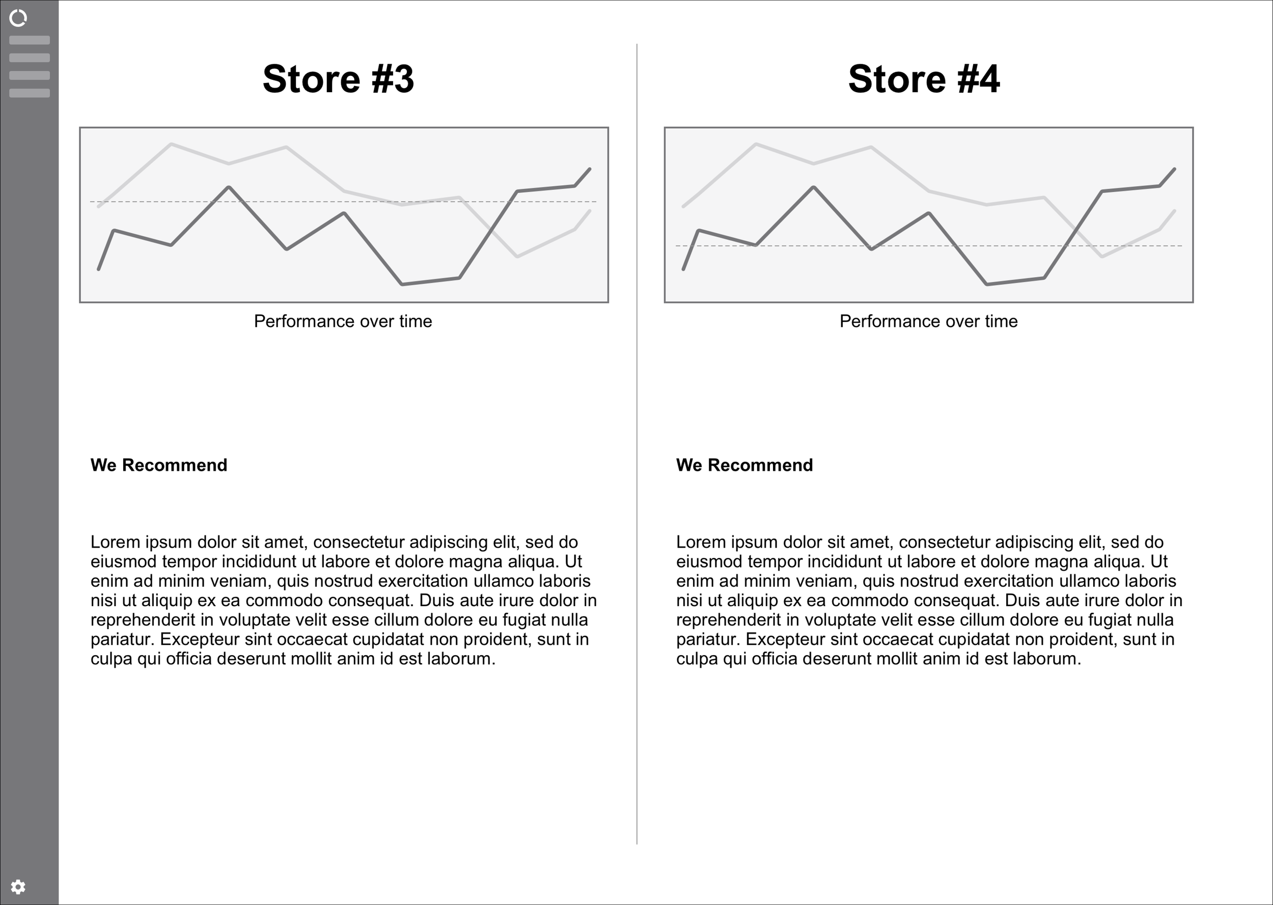
Comparing Stores
Using numbers and/or graphs to compare results between stores and comparing stores to the overall benchmark. Managers like the ability to see how other stores are doing so that they know if their own store needs to work on certain areas or are excelling in other areas.
Today’s Teams & Goals
Gives rundown of the day’s team, their strengths and weaknesses, as well as the store goals for the day. A great way to see the team and its goals in a snapshot. This tool is specifically advantageous to managers who want to see where to place employees in terms of departments and shifts.

Sentimental Analysis
Numerical scoring/scaling of words and phrases in customer feedback. This is a great way of translating words and comments into numbers that show concretely the progress of an employee or store.

Employee Forecast
Using trends to make daily predictions about how everyone will score based on their past performance. This was the least liked concept because of the additional data that would be needed to implement as well as the need for historical data to make forecasts.

Canvas Glance
I created this concept to give users the ability to pick and choose expandable and collapsible views of data ie. employee feedback, overall store analytics, company stats, etc. This concept was well received by users and the client because it gives options and customizability in ways to view different types of data on different levels such as stores, employees, and company data.

The Iteration

Before (Left) and after (Right) iterations.
The content for this screen was iterated based on feedback from usability testing. The content for the bottom modules were deems unnecessary because as an overview, there should be more glanceable numbers to look at rather than stats. I reorganized the modules from screen one and iterated to the second screen on the right.
The Final Design
The Next Steps

Iterations on current pages in prototype
Provide an archive for the goals and stats that have passed
Conduct further research into what modules should be present to showcase any additional data that is added to the Compare page and test the data visualizations
Sentiment Analyzer page - integration with social media to get a more complete view of customer feedback and provide a customizable key word lists catered to each company
Adding an employee page to show details on associates

Conduct further research into taking the feedback and performance of a store and its associates and then creating a coaching plan or some sort of recommended path to help associates perform better and to also continue to perform well

Predictive Analytics - conduct further research and testing into whether or not this is a viable addition to the product as well as how it would be implemented. A next step if chosen to implement would be to test versions of this additional component to gain user insight and expand on what uses it could provide
Personal Takeaways
Working on RaterBee called for a lot of validation with what the client already found in testing as well as expectations they had from the customer facing interface. I learned a lot from the broken line of communication between the client, the team, and with the interviewees. It’s important to not forget about all parties of the project to stay aligned with the goals.
The direction taken with this project was a good experience because the product was very much in line with the client’s expectations. Our challenge was to see if research and interviews would validate the client’s expectations and in what direction we would be heading down in terms of project scope.


