Client OkaySo
Role UX/UI Designer
Timeframe April — September 2022
Tools Figma, Squarespace
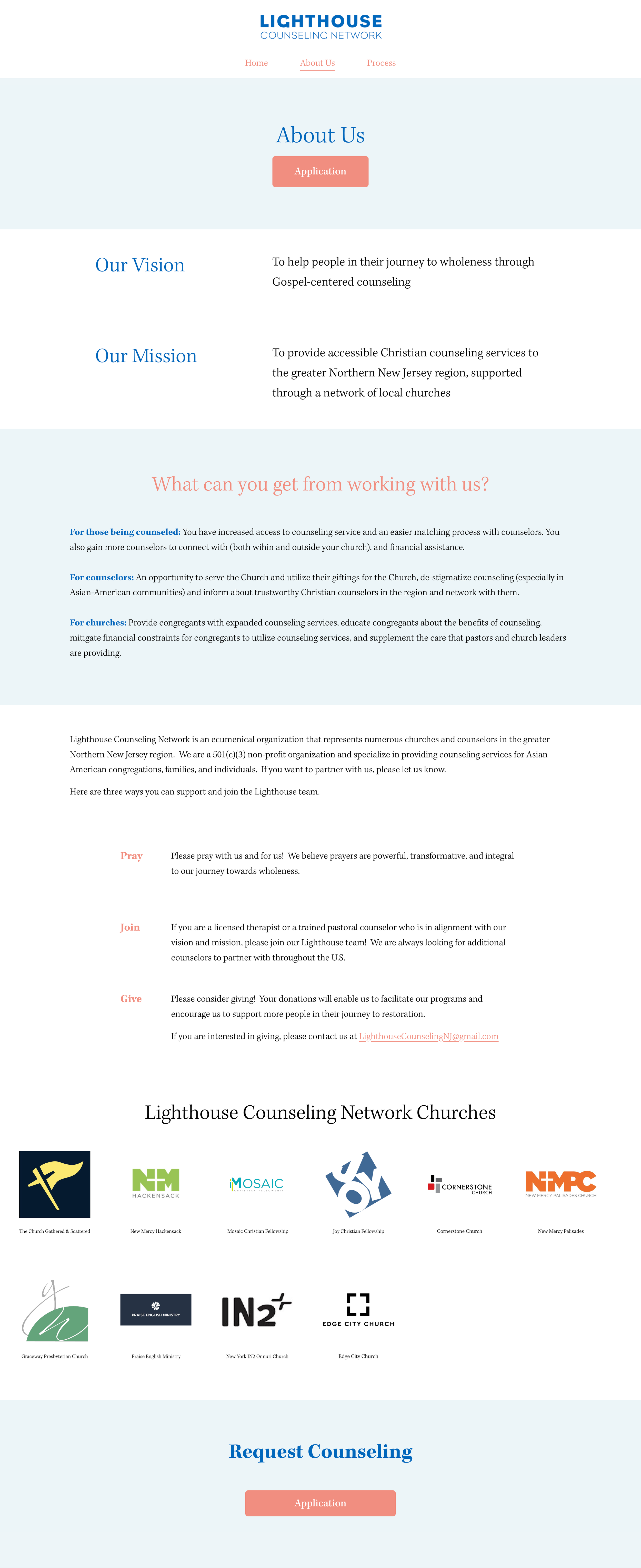
Our vision is to help people in their journey to wholeness through Gospel-centered counseling. Our mission is to provide accessible Christian counseling services to the greater Northern New Jersey region, supported through a network of local churches.
Lighthouse Counseling Network is a ecumenical organization that represents numerous churches and counselors in the greater Northern New Jersey region. We are a 501(c)(3) non-profit organization and specialize in providing counseling services for Asian American congregations, families, and individuals.
The Challenge
Before the completion of this project, Lighthouse Counseling Network used a Google form given to anyone who asked, that would send responses to the admin email. The founder of the network would then have to go through all the responses, making sure each one was recorded and updated as need be.
The Problem
Lighthouse Counseling Network needs a no frills website that contains all necessary information for prospective and existing counselees in order to create an online space that organizes forms seamlessly and without the extra manual work as well as an online presence that has the network’s branding.
The Work
In working with Lighthouse Counseling, their needs were not to compete with similar brands and organizations, but to purely provide information needed for users to submit forms and have a website to know who to reach out to for questions. Lighthouse provided their organization proposal slide deck to me to use as inspiration for what information to have on the website, the information needed for forms, and the layout of the website.
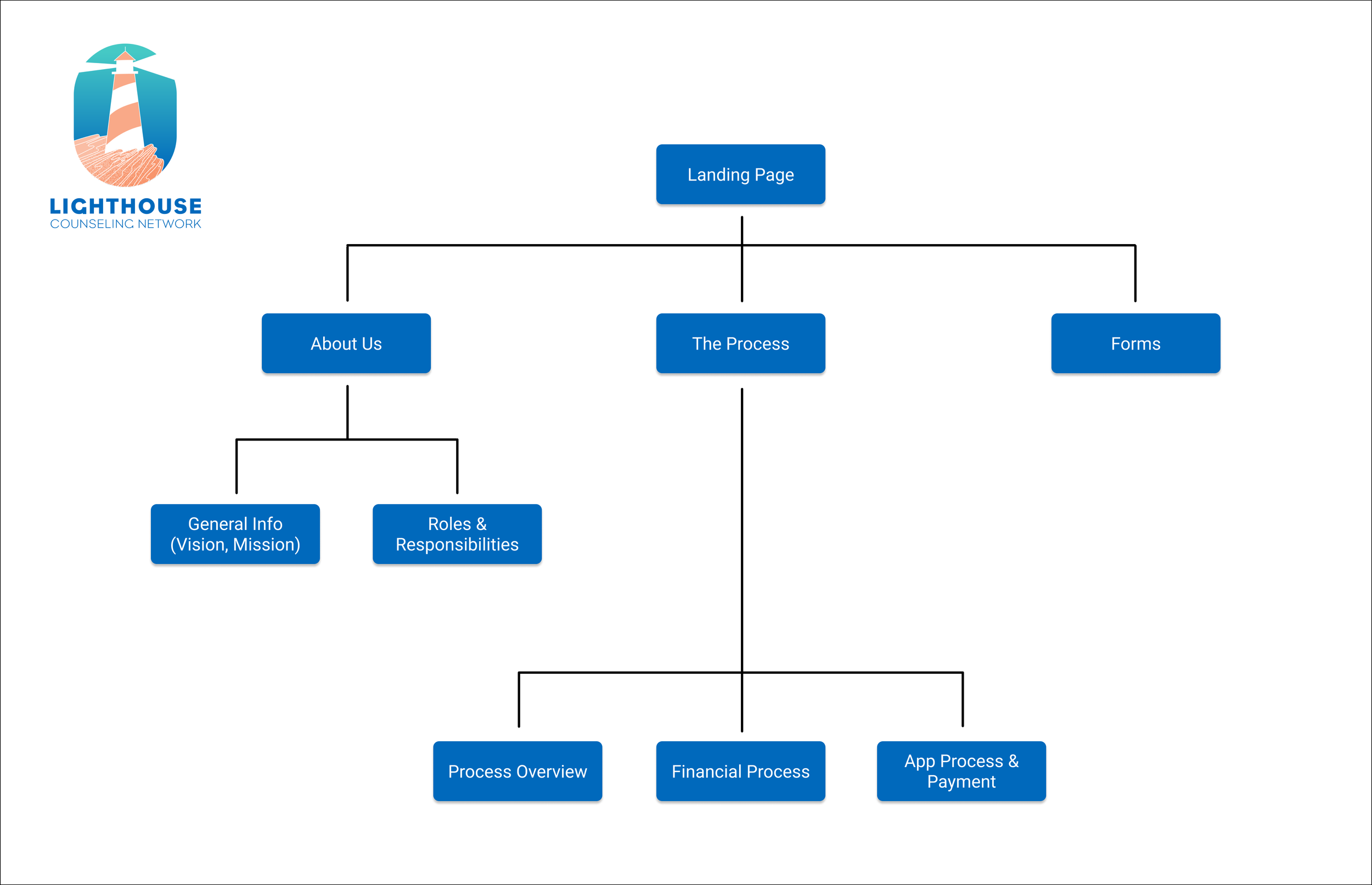
Site Map
The left-side was the initial map from the whole collection of information given in the deck. After an iteration of wireframes, I simplified the map down to the image on the right. The less pages there are, the less work for users to click through the website to find what they’re looking for and to complete the task their doing.

First Iteration Wireframe
The purpose of my first set of wireframes (below) was to lay out as much relevant information from the slide deck onto the website before cutting it down during a review with the client.

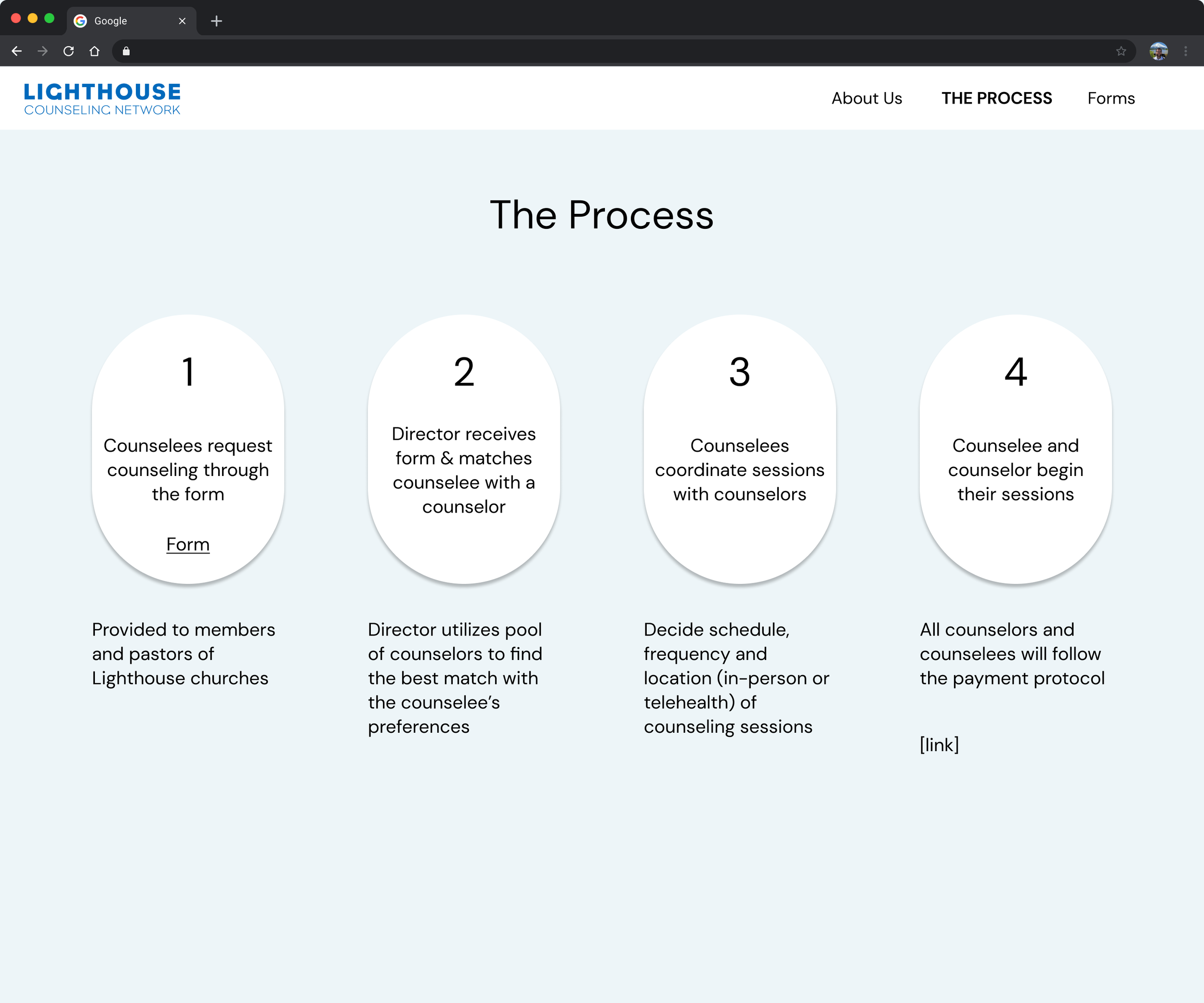
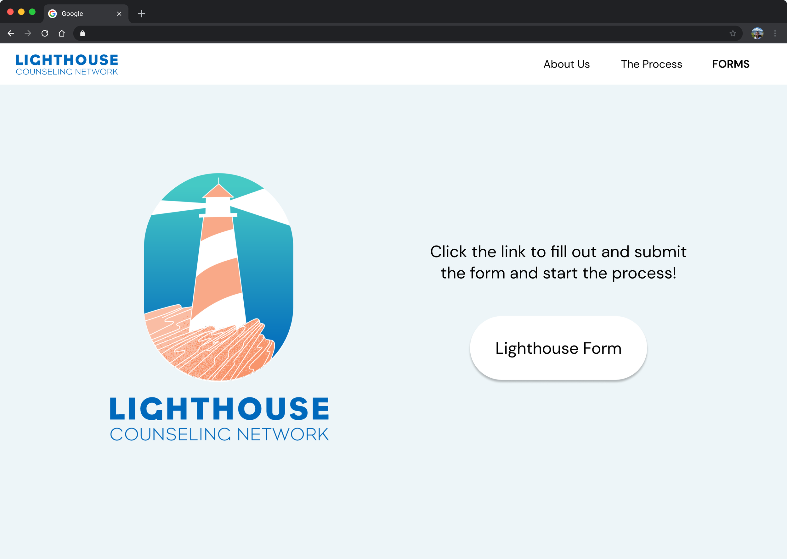
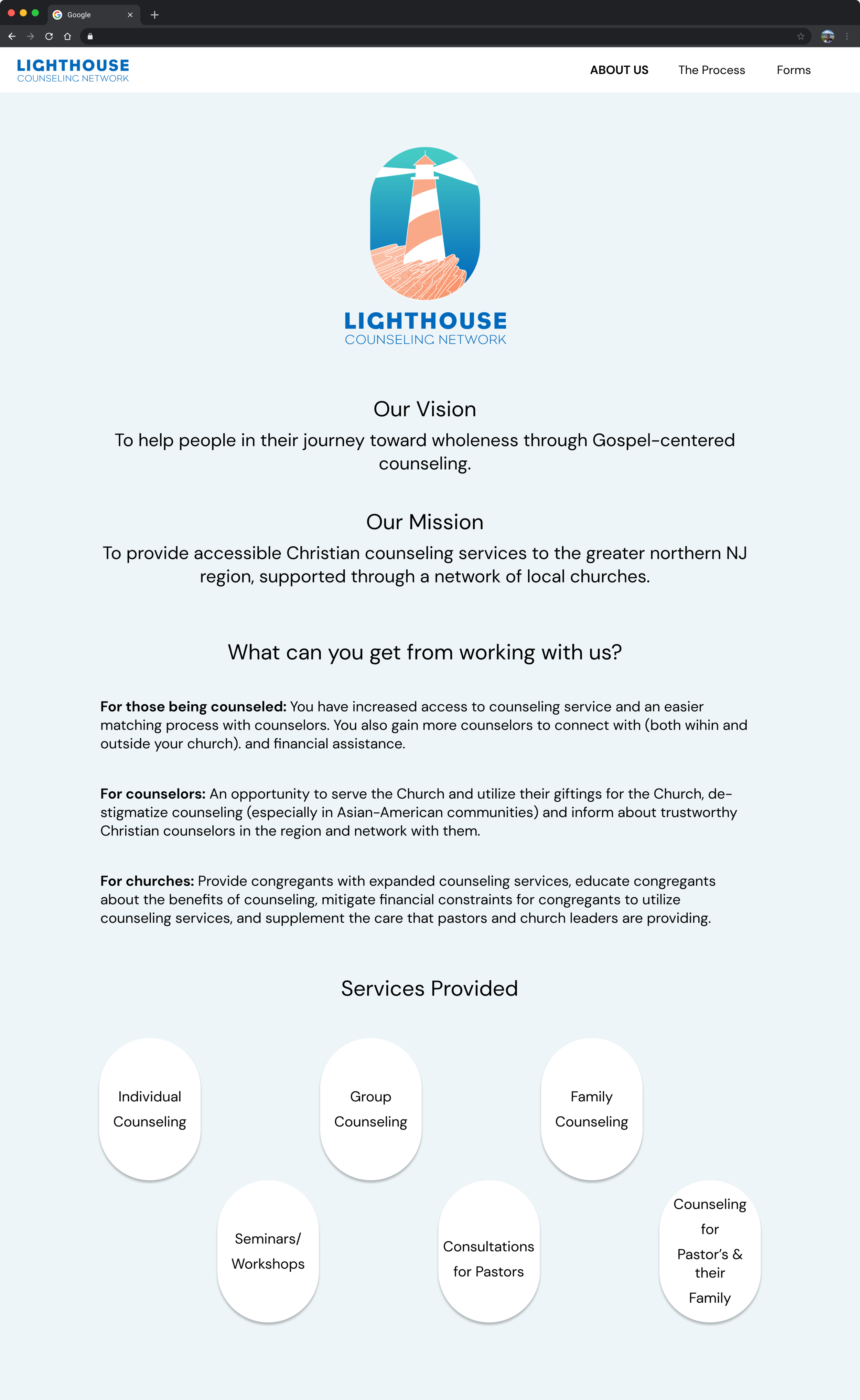
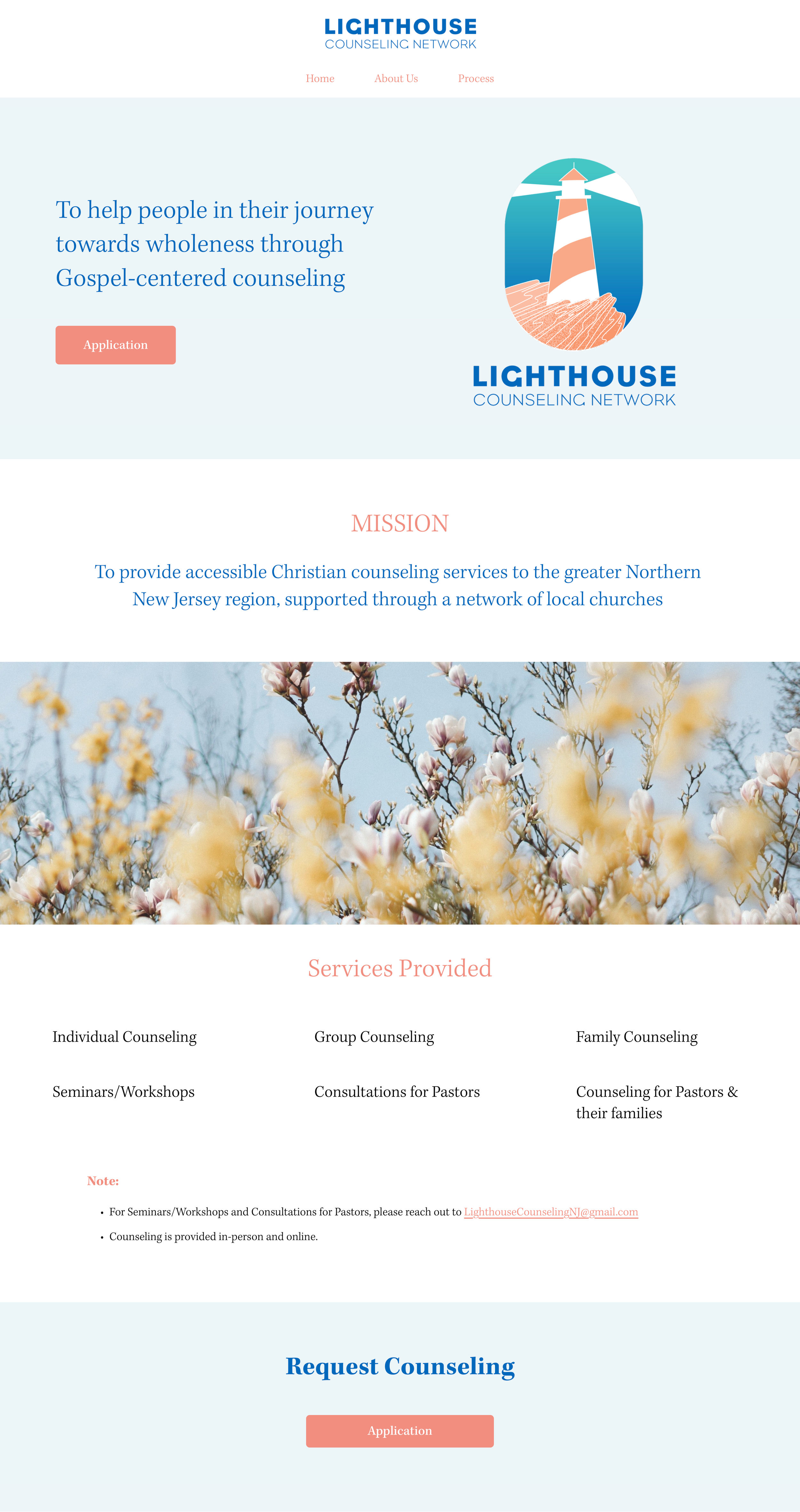
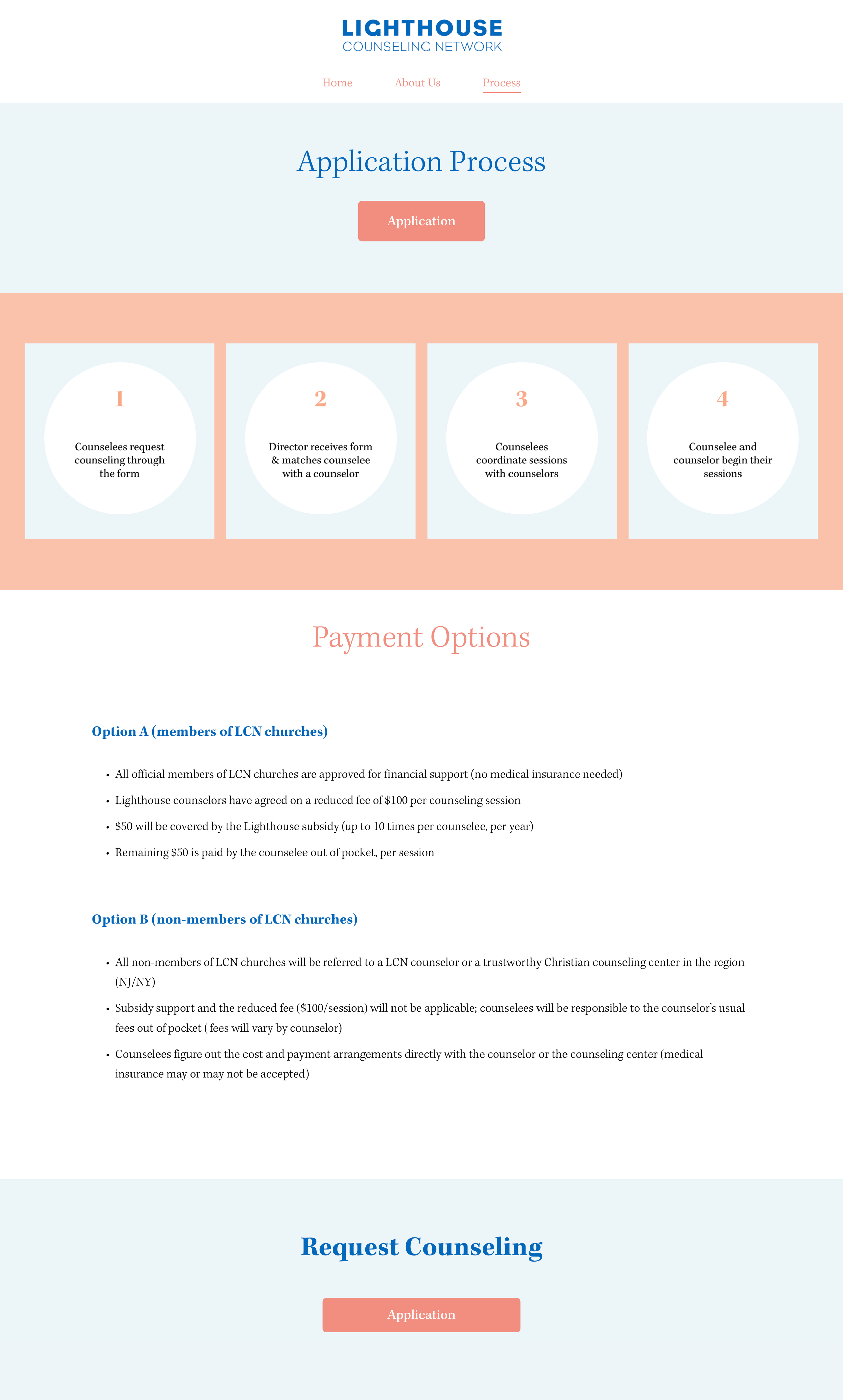
I took these wireframes and had a brainstorming session with the client to go through each section and determine which parts were necessary and which we could remove. The review resulted in the below final website with simple colors requested by the client and a layout that would not take away from the information. A big component that I wanted on all the pages was the link to the application so that users would never struggle to find it. Because the website is for people looking for counseling, it’s important to have that link from prospect to counselee to be as seamless as possible.
Final Website
Final Thoughts
For this project, the purpose was to put the users as the absolute main focus over the stakeholder, and even over a complex design. The challenge for me was the reel back on creating a UI with lots of color variations and fun graphics. It was also a challenge to consolidate a whole deck of information. It’s the conflicting desire between wanting to give all the information possible to the users, but also making sure the copy is in bite sizes.
Overall, the project was a success. The client was happy with the access to the application, the minimum number of pages that reduces clicks for users, and the light coloring of the website.


