(Alias for client)
Agency Boost Labs Inc.
Client Alias hooli
Role UX/UI Designer
Timeframe October 2022 — April 2023
Tools Monday.com, Figma, Tableau
For the purposes of this case study, the organization’s alias will be Hooli, to adhere to the privacy of the client that I worked with via Boost Labs agency. Hooli is a leading provider of commercial and residential roofing, siding, windows, decking, insulation, specialty lumber, waterproofing, and air barrier systems in the North American industry.
The Challenge
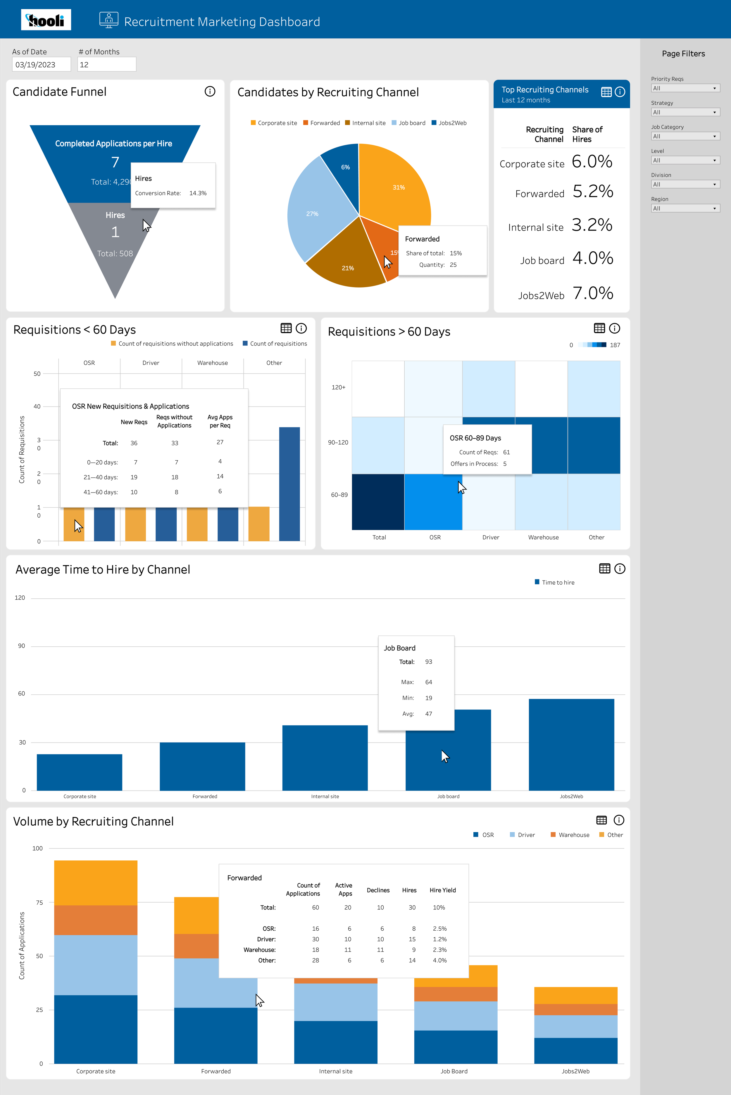
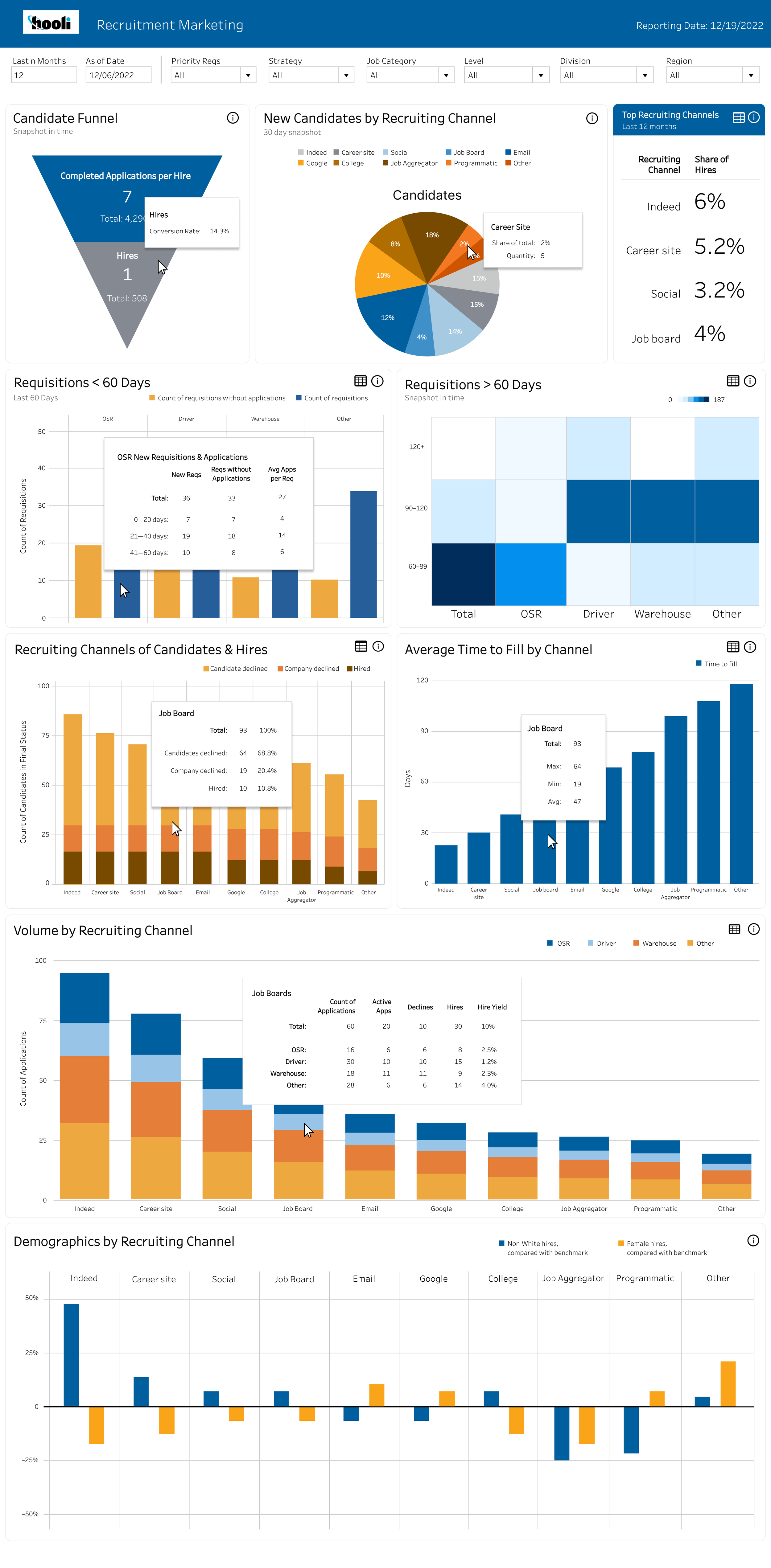
Before the start of this project, Hooli had previously worked with Boost Labs to create an early version of the dashboard that I worked on during this project. The previous dashboard was not available to me, as we started work from scratch with sketches. The project scope was to create dashboard layouts using charts to visualize data collected by the company. This data visualization would aide in employee, regional, and company performance and trends that exist in order to make appropriate changes.
The sketches and wireframes were all created on Figma, and the final product was created on Tableau. For purposes of my part of this project, the deliverables shown will only be from Figma.
The client requested a total of four final wireframes for four dashboards that would be passed to the developer to replicate on Tableau. The extent of deliverables I can share on this case study will be anything that I created on Figma.
The Process
In a project like this, when the client knows what product they want, but need help with visualizing the final design with the correct data points, the brainstorming sessions and preliminary meetings give insight for initial sketches. From sketches to each version of the wireframe, a meeting is held with the client to comb through every detail to make sure we are capturing all that we need to.
Sketches
Working alongside the head designer, we sketched up layouts for dashboards to determine the hierarchy. Below is an example of two of the dashboard sketches. My process is to always start as simple, especially when working with a whole team on the client’s side. Each step we add more complexity until we reach a final design that everyone feels confident in.


First round of feedback
Since we are using Tableau in the client’s final dashboard, there was no need for low fidelity wireframes as there is already a general style to the charts, tables and diagrams. In this step, we presented version one to the clients for another round of feedback.


Second round of feedback
After the first round of feedback, I went back to the wireframes to make the appropriate revisions along with any suggested changes I can see that made sense for the two dashboards.


Final Wireframes
All of the feedback I received during our meetings fed into the different data points I visualized on the various modules on the wireframes. It’s at this point that we’d work with the developer to see what was actually possible on Tableau, and then adjusting the wireframes to account for any restrictions.